Posters & Infographics
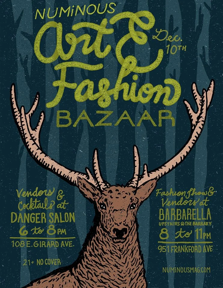
NUMiNOUS Art & Fashion Bazaar
This poster was created for an event for Numinous Magazine. Featuring hand-drawn art that has been digitally arranged and colored. Standing on a background of trees that read as a striped pattern, a stag catches the viewers eye and also provides organization to the text. As this was an event taking place at two separate locations, I kept them on similar hierarchies organizing further utilizing text style. To stand out from the crowded forest of posters with a red and white seasonal palette, I choose dark earthy colors. Still fitting for the dark half of the year.

NUMiNOUS Speakeasy Event Flyer
I designed this flyer with 1920's deco in mind. I aimed to create an elegant yet simple design to showcase all the needed information, the result is a clean, graphically striking flyer that melds the classic style with the modern magazine.
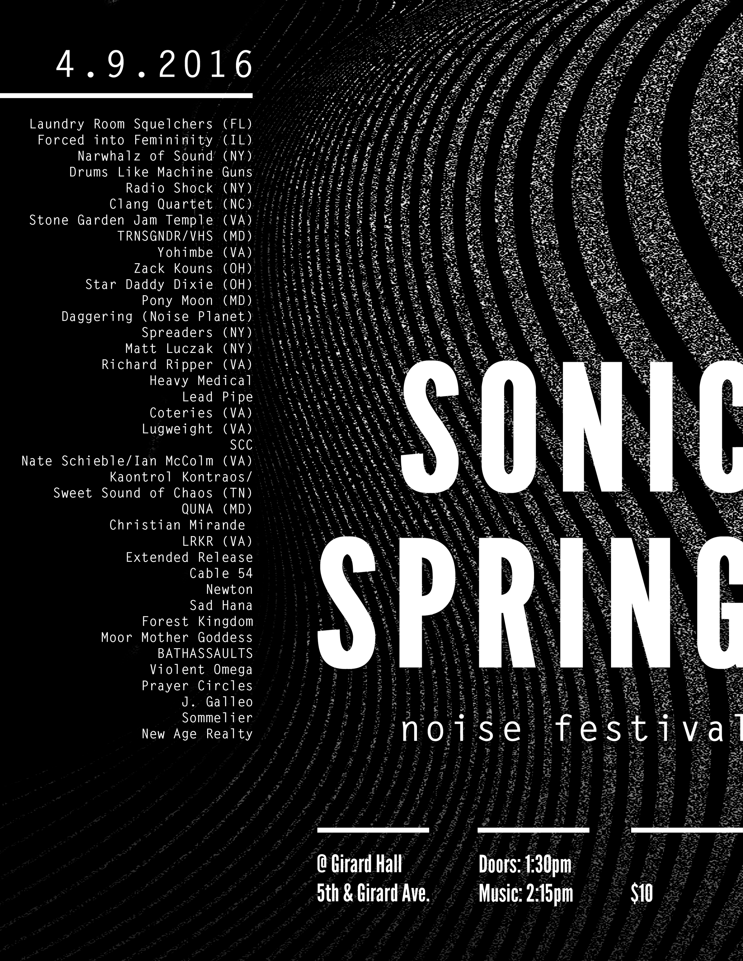
Sonic Spring Noise Music Festival
“Noise music is a genre of music that is characterised by the expressive use of noise. This type of music tends to challenge the distinction that is made in conventional musical practices between musical and non-musical sound.”* Seeing noise music live is an incredible and often one of a kind experience. Particularly when involving the real time manipulation of instruments and sound creating devices. This poster was inspired by soundwaves, and themes of distortion and static. This one day festival featured artists from across the US, representing many variations of the genre. Information is arranged in a grid and considers heirarchy of typography in displaying clear communication.
* Priest, Eldritch. "Music Noise" in Boring Formless Nonsense: Experimental Music and The Aesthetics of Failure, p. 132. London: Bloomsbury Publishing; New York: Bloomsbury Academic, 2013.

IPL Photo Facial Infographic
This infographic was created for Dermacenter Medical Spa to inform and attract clients of the IPL service. Viewers may not know what IPL, Intense Pulsed Light stands for or the benefits for its use in facials. This infographic takes a Frequently Asked Questions approach to the service. Questions asked lead to information displayed through graphics and supporting text. The colors and font choice were all informed by Dermacenter’s branding.

Breast Cancer Awareness Infographic
This image was shared on the Rittenhouse Women’s Wellness Center social media in the month of October, Breast Cancer Awareness Month. The goal of this piece was to inform viewers about the prevalence of Breast Cancer as well as the risks, encouraging patients to speak to their doctor about their personal histories. Being posted on social media, the design needed to be simple and easy to read, which lead to an infographic approach, with bright colors and bold text, yet still informed by the existing RWWC branding package.


Flu Shot and Melanoma Awareness Infographics
The two images above were created to alert patients of important health information, giving patients more tools to maintain their health. Patients were also made aware of what Rittenhouse Women's Wellness Center services are available. These images were also formatted for multiple social media websites across RWWC’s accounts and their monthly newsletter. They use grids and text styles to quickly relay information.

Healow Phone Application Promotional
This poster was created to inform the patients of the Rittenhouse Women’s Wellness Center of an easy way to access their patient portal through the use of the Healow phone application. This design showcases various levels of information. With the healow logo and text notifying paients of an easy way to access their heathcare information. The viewer can grab information quickly or read more details. Where the app can be found is also included as is a direct route via QR code.

AIA Lecture Series Poster - Andrea Zittel
This poster was created while at Moore for an American Institute of Architects lecture series on artist, sculptor, and designer Andrea Zittel. The imagery mirrors the shapes and colors Zittel uses in much of her art and installations. The typography reflects her modular, geometric design. This poster was also recognized in the Adobe Design Achievement Awards as a Semi-Finalist - Print Communications. It is also included in the book, “Creative Anarchy: How to Break the Rules of Graphic Design for Creative Success” by Denise Bosler. This poster opens chapter 8, “Make Things the Same—or Different. The showcasing of this poster being to provide an example of the Gestalt principle of proximity. As in this design overlapping objects and grouped text creates strong proximity, useful in designs with more than one set of informational content, both organizing the design and communicating the information clearly.