Reports
The State Policy Pilot Program
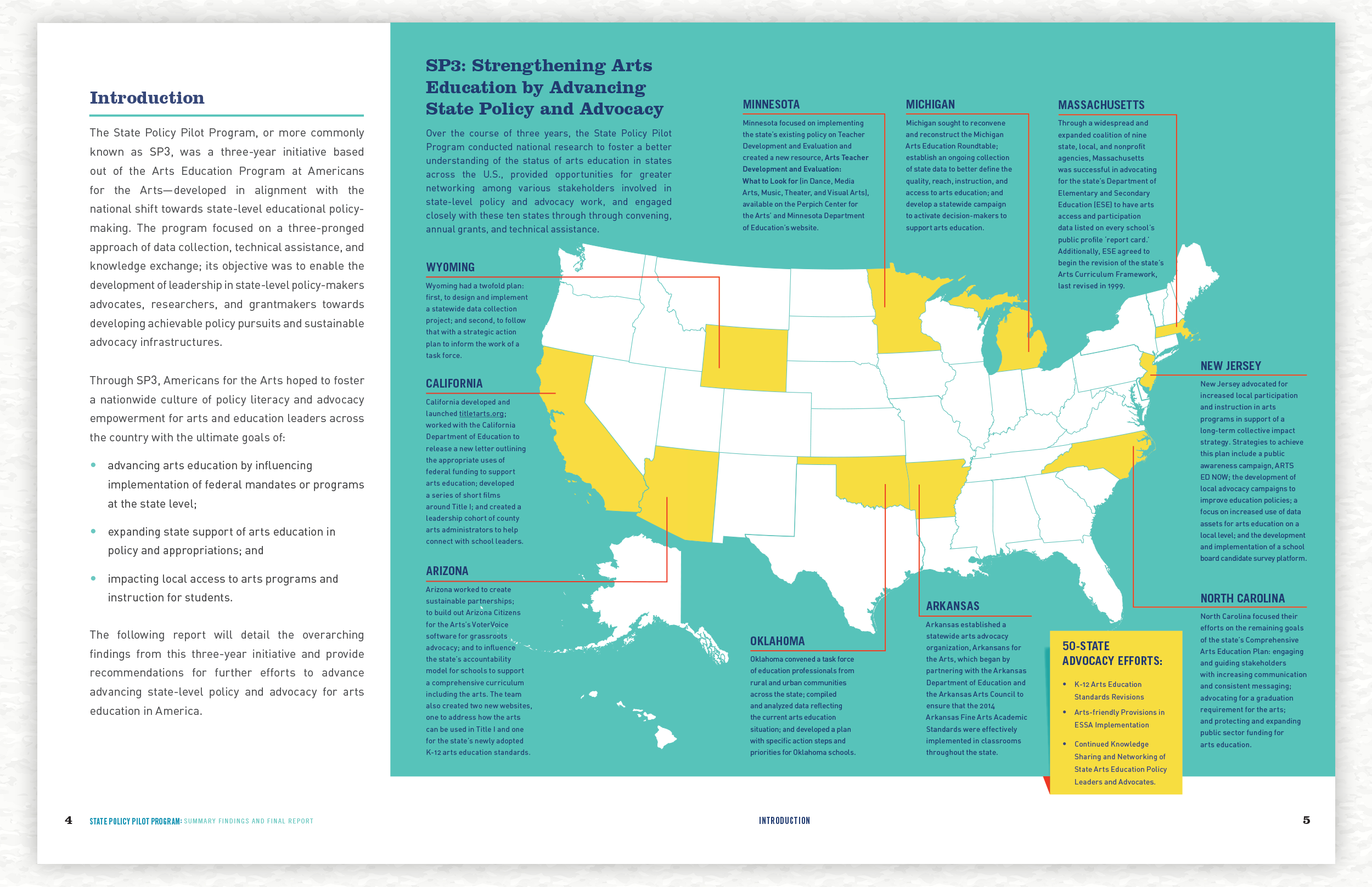
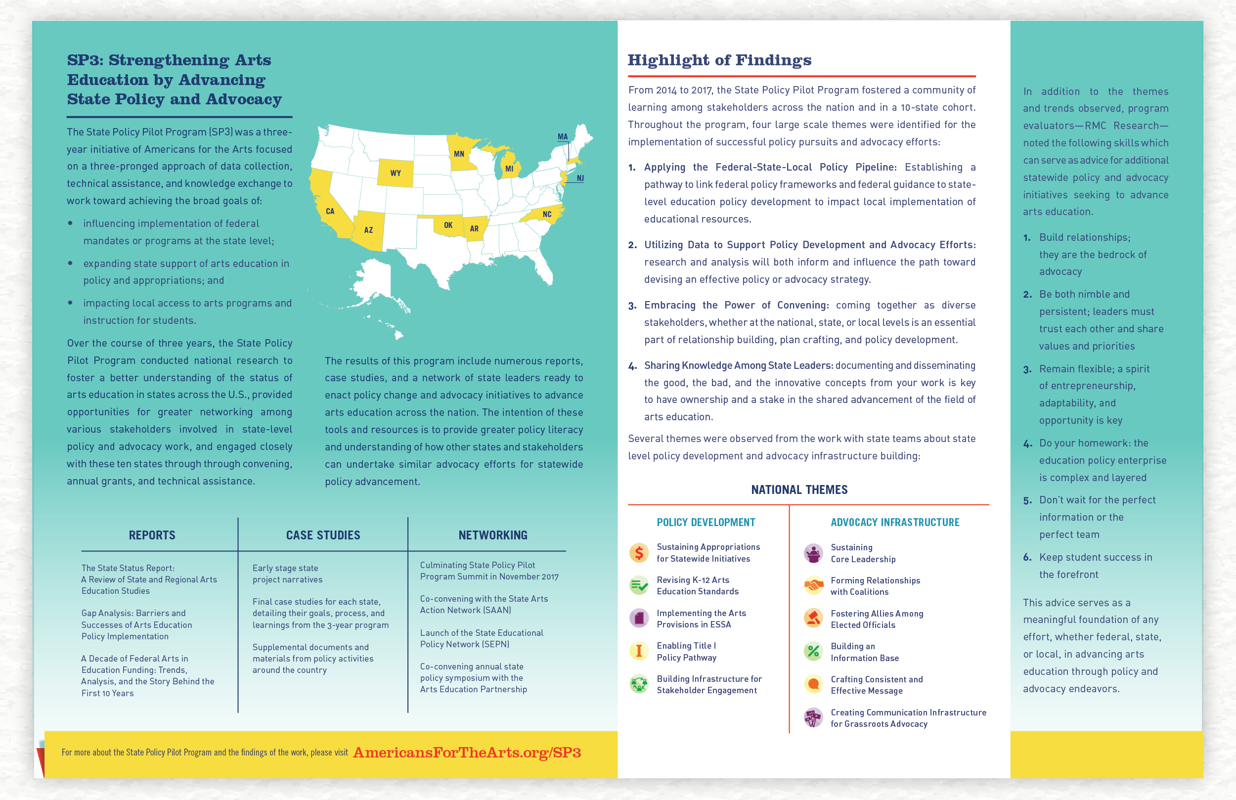
The State Policy Pilot Program (SP3) was a three-year initiative of Americans for the Arts focused on a three-pronged approach of data collection, technical assistance, and knowledge exchange to work toward influencing implementation of federal mandates or programs at the state level; expanding state support of arts education in policy and appropriations; and impacting local access to arts programs and instruction for students. Through annual grants and technical assistance, Americans for the Arts empowered leaders and stakeholders from ten state teams seeking to strengthen arts education by advancing state policy in Arizona, Arkansas, California, Massachusetts, Michigan, Minnesota, New Jersey, North Carolina, Oklahoma, and Wyoming.
Client: Americans for the Arts, Saygrid
Art Director, Template and Icon Designer: Andee Mazzocco
Layout Designer: Lauren Ladner
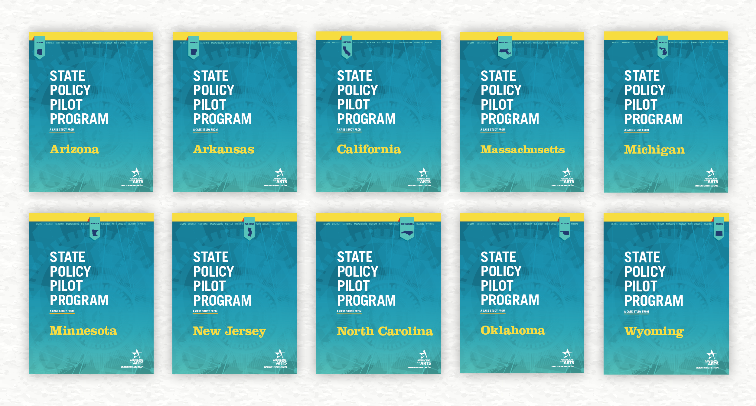
Keeping a consistent look throughout all the case studies was a main focus. Each state had unique data to portray which was achieved through text styles, graphs, and charts, whose style carried throughout each state. The color and font choices were guided by Americans for the Arts existing branding. The “tab” design approach as seen above is a quick way to reference which state is being reviewed. The footer was also utilized in this way, with state names in bold, as well as stating the section being discussed.
Each state’s case study contained a spread detailing national trends as well as introducing the set of icons you’ll see throughout each study. The icons helped identify patterns in a plethora of information giving quicker understanding of the text and its context.


With so much information to convey, it was important to organize the text into digestible sections. Breaking down and illustrating ideas where ever possible. This included the use of timelines, some states had more or less detail for these. In these cases, further organization was needed using text styles and brackets. Photos were included where ever possible to provide a visual break and further highlight important projects implemented during the program. “Footnotes” were included in the margins, allowing the reader instant access to needed context. Bold quotes were highlighted within the text, saving space, but also providing the directness of a pull quote.
These reports were well received and we were asked to complete a findings summary document as well as an appendix and two page handout to supplement this project.
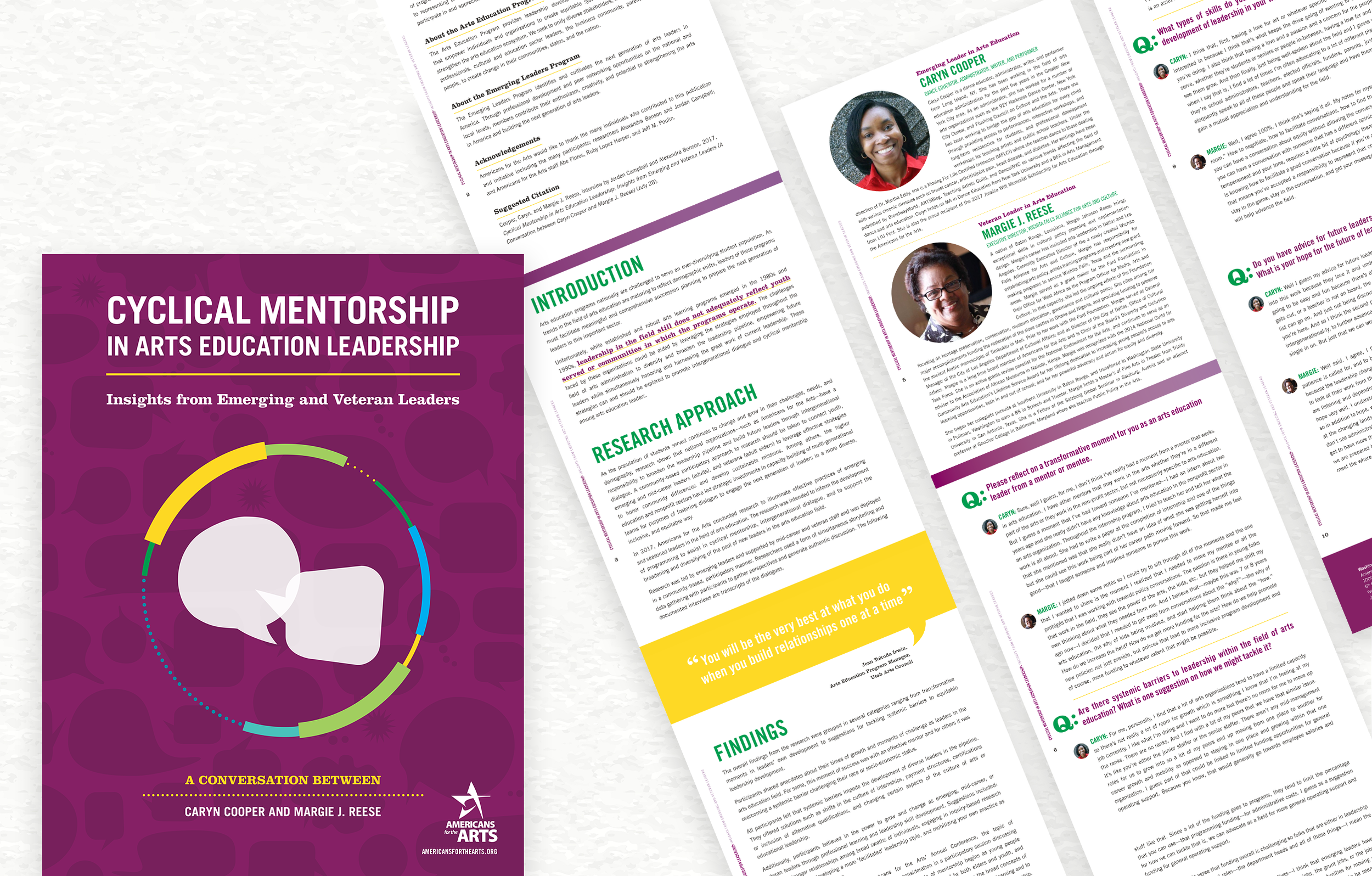
Cyclical Mentorship in Arts Education Leadership: Insights from Emerging and Veteran Leaders
BRIEF
Design for a series of case studies for Americans for the Arts. Each study paired emerging and veteran arts education leaders in conversation. The final document contains the transcription of these conversations as well as an overview of the process and findings. The case study and the design choices highlight perspectives on these broad themes and is intended to inform and inspire emerging, mid-career, and veteran leaders to engage in the work.
Client: Americans for the Arts, Saygrid
Art Director: Andee Mazzocco
Graphic Designer: Lauren Ladner
MORE ABOUT THE STUDIES
Arts education programs nationally are challenged to serve an ever-diversifying student population. As trends in the field of arts education are maturing to reflect demographic shifts, leaders of these programs must facilitate meaningful and comprehensive succession planning to prepare the next generation of leaders in this important sector. The overall findings from the research were grouped in several categories ranging from transformative moments in leaders’ own development to suggestions for tackling systemic barriers to equitable leadership development.


The design process of creating the image for the cover can be seen in the four images above.
PROCESS
For this project, I was tasked to develop design concepts as well as eight unique documents for these conversations. There was a focus on keeping things consistent throughout the series of eight case studies, while allowing some room for each unique conversation to be showcased.
The color palette was informed by AftA’s existing brand standards. Three of their secondary colors were used in all the text and graphic styling.
The cover was inspired by the back and forth conversation, and how they can come full circle. Even leaders can always be learning from those they lead. The document has its own flow, with colors spilling from top to bottom, margins leading you further into the conversation. The design urges the reader to keep scrolling and engaging with the document. The result is an energizing and inspiring piece that encourages engagement with the work.
Click below to download a pdf of one of the case studies!